Unit 13 使用 Angular Flex-Layout 製作 RWD 版面佈局
簡介
Grid Directives in Angular Flex-Layout
CSS Grid Layout 快速入門
CSS Grid Components
- Track
- Line
- Cell
- Area
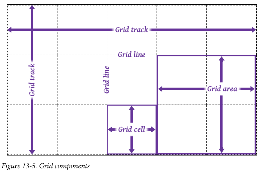 Source: F13-5 in “CSS The Definite Guide, 4th Edition”
Grid Directive vs Grid Css property
Angular Flex-Layout 的 Grid Directive 與 Grid CSS Property 間的對應關係:
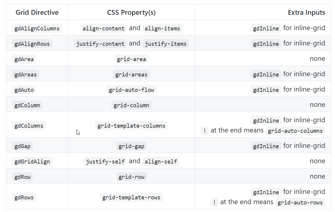
| Source: [CSS Grid with Angular Layout | angular/flex-layout](https://github.com/angular/flex-layout/blob/master/guides/Grid.md) |
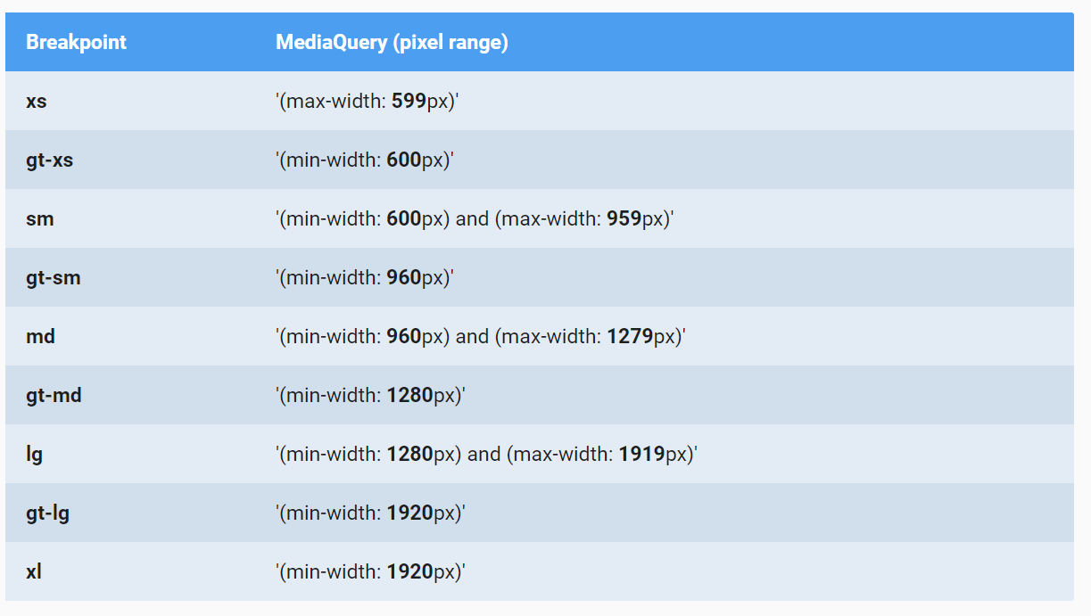
RWD Breakpoints in Angular Material
RWD Breakpoints and aliases from Angular Material:
The breakpoint aliases and the pixel ranges used by the Angular Material:
| App 的頁面 layout 原則可參考: [UI regions | Material Design](https://material.io/design/layout/responsive-layout-grid.html#ui-regions) |

Grid Directive with RWD Breakpoints
Angular Flex-Layout directives can take a breakpoint alias as the syntax: <directive>.<breakpoint alias>.
For example:
1
gdColumn.gt-sm="20% auto 20%"
實作 1 使用 Grid Directive 製作 RWD 版面
使用程式取得現在的螢幕寛度 MediaObserver
Example:
1
2
3
4
5
6
7
8
9
10
11
12
13
14
15
16
17
18
...
import { MediaChange, MediaObserver } from '@angular/flex-layout';
...

export class GridLayoutComponent implements OnInit {
  public mediaAlias$: Observable<{mqAlias: string, mediaQuery: string}>;

  constructor(private mediaObserver: MediaObserver) {
    this.mediaAlias$ = mediaObserver.asObservable()
      .pipe(map((value: MediaChange[]) => {
        return {
          mqAlias: value[0].mqAlias,
          mediaQuery: value[0].mediaQuery
        }
      }));
  }
...
}
| Source: [JavaScript API (Imperative) | angular/flex-layout](https://github.com/angular/flex-layout/wiki/API-Documentation#javascript-api-imperative) |
Flex Layout

Figure source: css-tricks.com
| Flexbox 的介紹, 參考 [A Complete Guide to Flexbox | CSS-Tricks](https://css-tricks.com/snippets/css/a-guide-to-flexbox/) |
FlexLayout Directives for the Flex Container
- fxLayout: Defines the flow order of child items within a flexbox container.
- fxLayoutGap: Defines if child items within a flexbox container should have a gap
- fxLayoutAlign: Defines how flexbox items are aligned according to both the main-axis and the cross-axis, within a flexbox container
FlexLayout Directives Child Elements within Containers:
- fxFlex
- fxFlexOrder
- fxFlexOffset
- fxFlexAlign
- fxFlexFill
| 更多的 Flex-Layout directives 參考: [HTML API (Declarative) | angular/flex-layout](https://github.com/angular/flex-layout/wiki/API-Documentation#html-api-declarative) |
實作 3: 使用 Flex-Box Layout 製作 RWD 佈局
實作 1 使用 Grid Directive 製作 RWD 版面
實作目標
Source: Angular Flex-Layout Demos
建立專案及 GridLayout 元件
建立專案並使用 RouteModule
建立新專案
1
ng new u13-practice
Generate the routing module
1
ng generate module app-routing --flat --module=app
安裝 Angular Flex-Layout library
Installing the Angular Flex-Layout library from npm
1
npm i -s @angular/flex-layout @angular/cdk
Import top-level FlexLayoutModule to app module:
1
import { FlexLayoutModule } from '@angular/flex-layout';
完成的 AppModule:
1
2
3
4
5
6
7
8
9
10
11
12
13
14
15
16
17
18
19
20
21
import { NgModule } from '@angular/core';

import { AppComponent } from './app.component';
import { AppRoutesModule } from './app-routes.module';
import { FlexLayoutModule } from '@angular/flex-layout';

@NgModule({
  declarations: [
    AppComponent,
    GridLayoutComponent
  ],
  imports: [
    BrowserModule,
    AppRoutesModule,
    FlexLayoutModule
  ],
  providers: [],
  bootstrap: [AppComponent]
})
export class AppModule  {}
建立 GridLayout 元件(第一個元件)
Generate the GridLayout component 並將元件加入 AppModule:
1
ng g component layout/grid-layout --module=app
開啟 src\app\app-routes.module.ts, 加入 GridLayout 元件的 routing path:
1
2
3
4
const appRoutes: Routes = [
  {path: 'grid', component: GridLayoutComponent},
  {path: '', redirectTo: 'grid', pathMatch: 'full'}
];
利用 appRoutes 的路徑資料在 import 時初始化 RouteModule, 之後在匯出此模組給其他模組使用.
完成的 codes:
1
2
3
4
5
6
7
8
9
10
11
12
13
14
15
16
17
18
19
20
21
import { NgModule } from '@angular/core';
import { CommonModule } from '@angular/common';
import {RouterModule, Route, Routes} from '@angular/router'
import { GridLayoutComponent } from './layout/grid-layout/grid-layout.component';

const appRoutes: Routes = [
  {path: 'grid', component: GridLayoutComponent},
  {path: '', redirectTo: 'grid', pathMatch: 'full'}
];

@NgModule({
  declarations: [],
  imports: [
    CommonModule,
    RouterModule.forRoot(appRoutes)
  ],
  exports: [
    RouterModule
  ]
})
export class AppRoutesModule { }
設定 GridLayout 元件需要的 CSS 樣式
1
2
3
4
5
6
7
8
9
10
11
12
13
14
15
16
17
18
19
.blocks {
    font-family: Roboto,"Helvetica Neue",sans-serif;
    font-size: 1.5rem;
    min-width: 75px;
    min-height: 50px;
    border-radius: 3px;
    color: white;
    text-align: center;
}

.header {background-color: #009688;}

.sidebar {background-color: #3949ab;}

.content {background-color: #b08752;}

.sidebar1 {background-color: #9c27b0;}

.footer {background-color: #5ca6b0;}
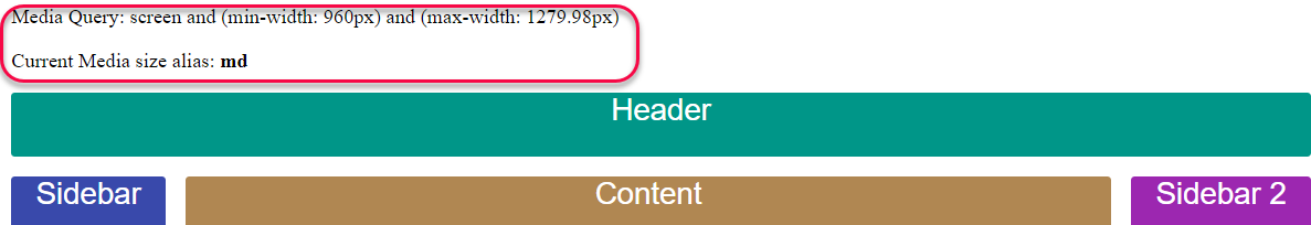
設定 GridLayout 元件的 RWD 版面佈局
加入 Non-RWD 的 Grid Layout
編輯 src\app\layout\grid-layout\grid-layout.component.html,
使用 gdAreas 設定各 grid area 所佔用的 track 個數.
gdColumn 指定各個 track 的寬度.
gdGap 指定各個 grid cell 之間的間隔寬度.
1
2
3
4
5
6
7
8
9
10
11
12
13
14
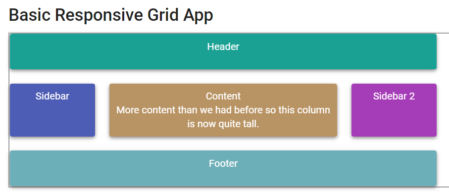
<p>Non-RWD Layout</p>
<div id='gridContainer' gdAreas="header header header | sidebar content sidebar1 | footer footer footer"
gdColumn="20% auto 20%" gdGap="1rem">
<div class='blocks header' gdArea='header'>Header</div>
<div class='blocks sidebar' gdArea='sidebar'>Sidebar (20% of width)</div>
<div class='blocks content' gdArea='content'> Content (Auto width)
<p>
More content than we had before so this column is now quite tall.
</p>
</div>
<div class='blocks sidebar1' gdArea='sidebar1'>Sidebar 2 (20% of width) </div>
<div class='blocks footer' gdArea='footer'>Footer</div>
</div>
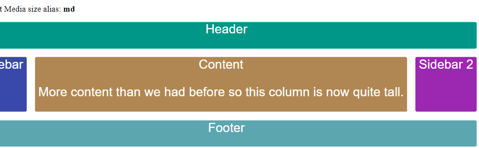
加入 螢幕寬度 md 以上時的版面佈局
版面欄位切割成為 3 tracks, 第 1, 3 tracks 的寬度為螢幕寬度的 20%, 第 2 個 track 的寬度使用剩下未使用的寬度.
header area 佔 3 tracks; sidebar, content, sidebar1 各佔一個 track; header area 佔 3 tracks.
1
2
3
4
5
6
7
8
9
10
11
12
13
14
15
<div id='gridContainer'
  gdAreas.gt-sm="header header header | sidebar content sidebar1 | footer footer footer"
  gdColumn.gt-sm="20% auto 20%"
  gdGap="1rem">

    <div class='blocks header' gdArea='header'>Header</div>
    <div class='blocks sidebar' gdArea='sidebar'>Sidebar </div>
    <div class='blocks content' gdArea='content'> Content
        <p>
            More content than we had before so this column is now quite tall.
        </p>
    </div>
    <div class='blocks sidebar1' gdArea='sidebar1'>Sidebar 2 </div>
    <div class='blocks footer' gdArea='footer'>Footer</div>
</div>
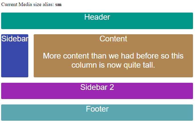
加入 螢幕寬度為 sm 時的版面佈局
版面欄位切割成為 2 tracks, 所有 tracks 的寬度為螢幕寬度的 20%.
header area 佔 2 tracks; sidebar, content 各佔一個 track; sidebar1 及 footer area 各佔 2 tracks.
1
2
gdAreas.sm="header header | sidebar content | sidebar1 sidebar1 | footer footer"
gdColumn.sm="20%"
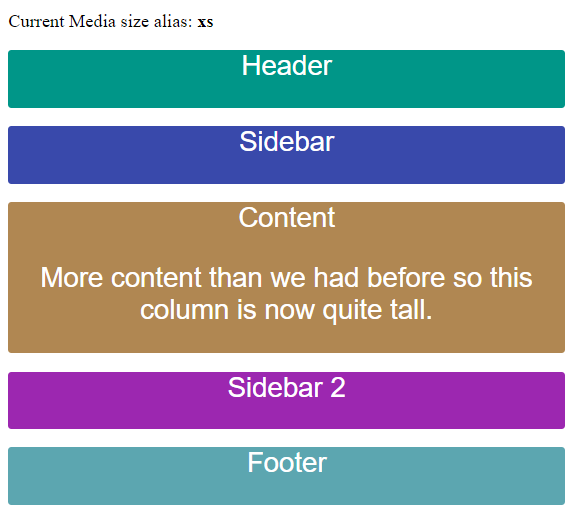
加入 螢幕寬度為 xs 時的版面佈局
各 area 佔 1 個 track.
1
gdAreas.xs="header  | sidebar | content | sidebar1 | footer"
完成的 codes
1
2
3
4
5
6
7
8
9
10
11
12
13
14
15
16
17
18
<div id='gridContainer'
    gdAreas.gt-sm="header header header | sidebar content sidebar1 | footer footer footer"
    gdColumn.gt-sm="20% auto 20%"
    gdAreas.sm="header header | sidebar content | sidebar1 sidebar1 | footer footer"
    gdColumn.sm="20%"
    gdAreas.xs="header  | sidebar | content | sidebar1 | footer"
    gdGap="1rem">

    <div class='blocks header' gdArea='header'>Header</div>
    <div class='blocks sidebar' gdArea='sidebar'>Sidebar </div>
    <div class='blocks content' gdArea='content'> Content
        <p>
            More content than we had before so this column is now quite tall.
        </p>
    </div>
    <div class='blocks sidebar1' gdArea='sidebar1'>Sidebar 2 </div>
    <div class='blocks footer' gdArea='footer'>Footer</div>
</div>
實作 2: 取得目前的螢幕度
建立 ViewPort 元件並注入 MediaObserver 元件
在元件中使用 MediaObserver
建立新元件 view-port
1
ng g c layout/view-port
匯入 MediaObserver 到元件中, 並從建構子參數中注入此服務:
1
2
3
4
5
6
7
8
9
10
11
12
13
14
15
16
17
18
19
20
import { Component, OnInit } from '@angular/core';
import {MediaObserver} from '@angular/flex-layout'

/**
 * 顯示目前的裝置的寬度
 */
@Component({
  selector: 'app-view-port',
  templateUrl: './view-port.component.html',
  styleUrls: ['./view-port.component.css']
})
export class ViewPortComponent implements OnInit {

  constructor(private mediaObserver: MediaObserver) { }

  ngOnInit(): void {
  }

}
使用 MediaObserver 取得目前的螢幕寬度
新增類別欄位 mediaAlias$
1
2
3
4
5
6
7
...
export class ViewPortComponent implements OnInit {

  public mediaAlias$: Observable<{ mqAlias: string, mediaQuery: string }>;

  constructor(private mediaObserver: MediaObserver) { }
  ...
Observable 內的資料型態為:
1
2
{ mqAlias: string,
  mediaQuery: string }
在 ngOnInit() 中, 取得螢幕寬度的別名(alias)及 media query 的結果:
1
2
3
4
5
6
7
8
9
10

ngOnInit(): void {
    this.mediaAlias$ = this.mediaObserver.asObservable()
    .pipe(map((value: MediaChange[]) => {
      return {
        mqAlias: value[0].mqAlias,
        mediaQuery: value[0].mediaQuery
      }
    }));
  }
從 MediaObserver 取得的 Observable 內的資料型態為 MediaChange[], 其第 0 個元素是目前螢幕寬度的資訊. 因此,
我們必須將 MediaChange[0] 轉成 :
1
2
{ mqAlias: string,
  mediaQuery: string }
MediaChange is an object that contains details about a mediaQuery event. It has the following properties:
matches- whether the mediaQuery is currently activated, defaults to falsemediaQuery- e.g. (min-width: 600px) and (max-width: 959px), defaults to ‘all’mqAlias- e.g. gt-sm, md, gt-lg, defaults to ‘’suffix- e.g. GtSM, Md, GtLg, defaults to ‘’
Source: angular/flex-layout
在樣版中顯示目前螢幕寛度
開啟 src\app\layout\view-port\view-port.component.html, 輸入以下程式碼:
1
2
3
4
<div>
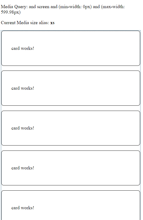
<p> Media Query: and {{(this.mediaAlias$ | async )?.mediaQuery }} </p>
<p> Current Media size alias: <b> {{(this.mediaAlias$ | async)?.mqAlias }} </b></p>
</div>
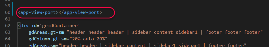
在 GridLayout 樣板中使用 ViewPort 元件顯示螢幕寬度資訊
開啟 src\app\layout\grid-layout\grid-layout.component.html, 加入以下的 codes:
執行結果
實作 3: 使用 Flex-Box Layout 製作 RWD 佈局
實作目標
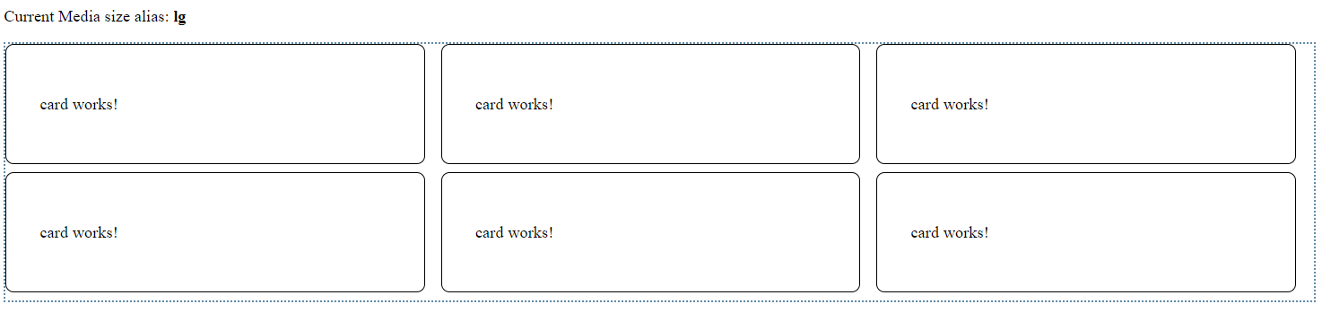
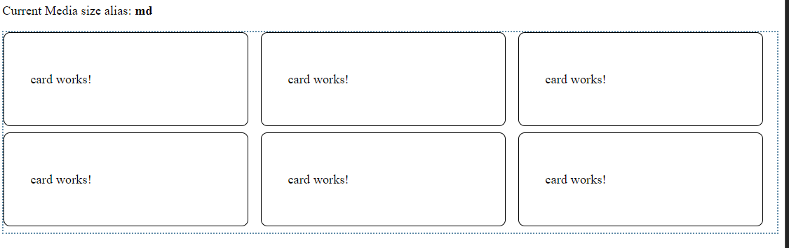
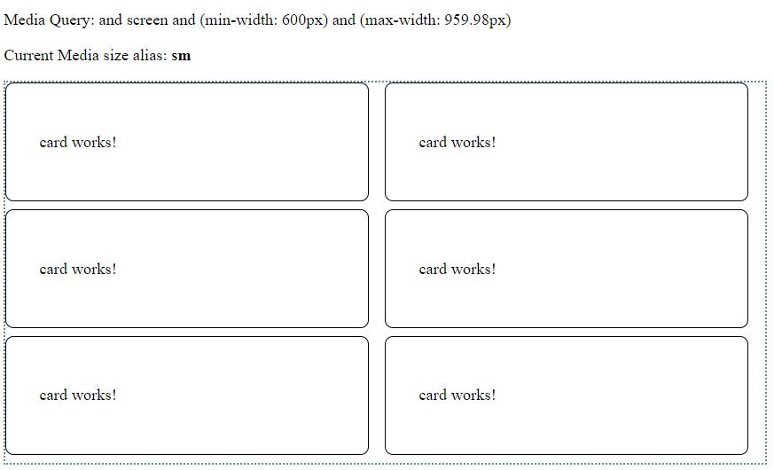
建立 Card 元件以卡片的方式顯示資訊
建立 Card 元件以卡片的方式顯示資訊
1
ng g component layout/card --module=app
設定元件的 CSS:
1
2
3
4
5
6
:host {
    display: block;
    padding: 32px;
    border: 1px solid black;
    border-radius: 8px;
}
補充說明: :host 及 :host-context 虛擬類別選擇器
- [Angular] Angular Component Host Style
-
[:host Angular](https://angular.io/guide/component-styles#host)
建立 CardList 元件顯示多張卡片
1
ng g component layout/card-list --module=app
專案中現在有 4 個元件:
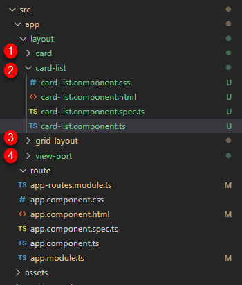
設定元件的 routing path. 開啟 src\app\app-routes.module.ts, 增加 flex path 給 CardList 元件:
1
2
3
4
5
6
const appRoutes: Routes = [
  {path: 'grid', component: GridLayoutComponent},
  // Added path
  {path: 'flex', component: CardListComponent },
  {path: '', redirectTo: 'grid', pathMatch: 'full'}
];
設定 CarList 元件的樣板. 開啟src\app\layout\card-list\card-list.component.html, 增加一個 div 標籤作為 flex 容器:
1
2
3
4
5
<div id="card-list"
    class="wrapper"
    fxLayout="row wrap" fxLayout.lt-sm="column"
    fxLayoutGap="1rem"  fxLayoutAlign="flex-start">
</div>
接著加入底下的 code 到上述的 div 中:
1
2
3
4
5
<ng-container *ngFor="let _ of [1,2,3,4,5,6]">
  <app-card fxFlex="0 1 calc(33.3% - 1rem)"
      fxFlex.lt-md="0 1 calc(50% - 1rem)"
      fxFlex.lt-sm="calc(100% - 1rem)"></app-card>
</ng-container>
ng-container 可將兄弟元素(sibling element)集合在一起, 而不需使用包覆元素. 與直接使用 div 作為包覆元素最大的不同, ng-container 標記並不會加入到 DOM 之中. 進一步的說明參考 [Group sibling elements with <ng-container> |
Angular](https://angular.io/guide/structural-directives#ng-container-to-the-rescue). |
使用 fxFlex 指令設定 app-card 在不同螢幕寬度下的元素寬度:
- 超過(含) md ( W >= 960px): 每個元素佔 1/3 的螢幕寬度
- 小於 md ( W < 959px ): 每個元素佔 1/2 的螢幕寬度
- 小於 sm ( W < 600px): 每個元素佔全部的螢幕寬度
完成的程式碼:
1
2
3
4
5
6
7
8
9
10
11
12
13
<app-view-port>
</app-view-port>

<div id="card-list" class="wrapper" fxLayout="row wrap" fxLayout.lt-sm="column"
                    fxLayoutGap="1rem"
                    fxLayoutAlign="flex-start">

    <ng-container *ngFor="let _ of [1,2,3,4,5,6]">
        <app-card fxFlex="0 1 calc(33.3% - 1rem)"
        fxFlex.lt-md="0 1 calc(50% - 1rem)"
        fxFlex.lt-sm="calc(100% - 1rem)"></app-card>
    </ng-container>
</div>
補充: CSS tricks
不選擇最後 n 個元素
1
2
3
#card-list > *:not(:nth-last-child(-n+3)) {
    margin-bottom: 0.5rem;
}
Ref: