Unit 20 CSS Flex-box Layout 簡介
簡介
-
Flex-box Layout 是一般化的一維佈局模式(one-dimensional layout model)。
-
flex-box 內的 item 的攞放, 可以水平方向放置, 也可依垂直方向放置。
- 主要流動方向的軸線稱為「主軸線(main axis)」
- 與主要流動方向垂直的軸線稱為「切軸軸線(cross axis)」
- 流動方向依主軸線或者切軸軸線流動


- 適用時機
- menu bar 內的項目佈局
- side bar 內的項目佈局
- 其它一維佈局
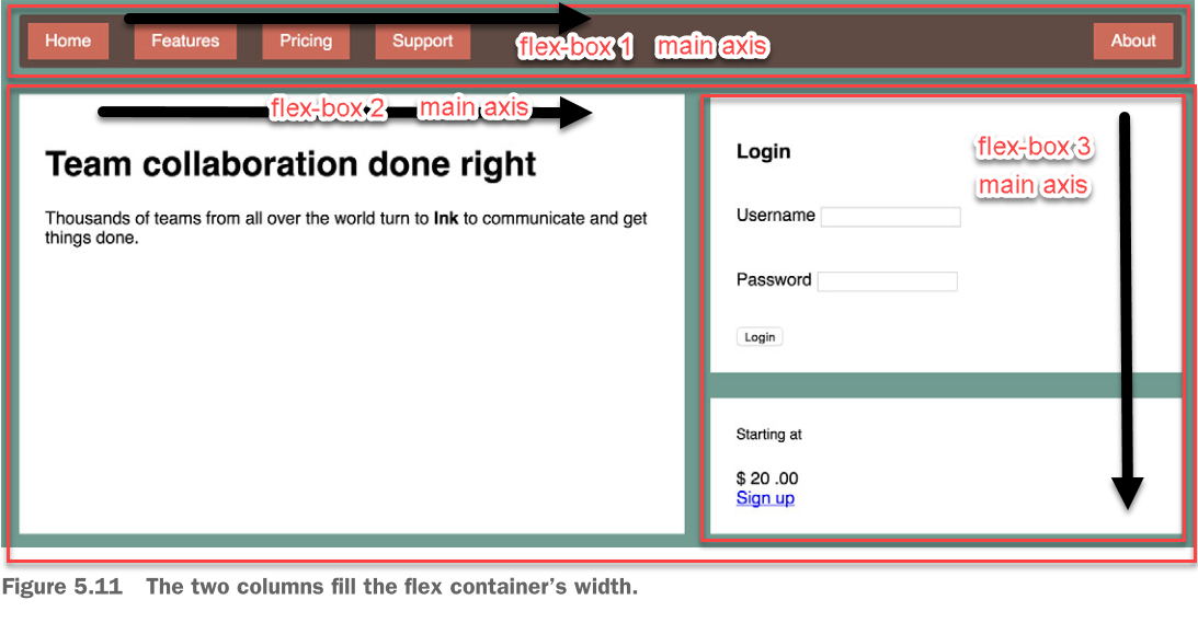
Figure Source: [2]
使用程序
-
建立 flex-box 容器

- 決定容器的 main axis 的方向, 可以是水平方向, 亦可是垂直方向
- 決定 flex item 流動的方向, 沿 main 或 cross 軸.

Figure Source: [1]
Example:
1
2
3
4
5
6
7
.flex-container {
    display: flex;
}

.flow-column {
    flex-direction: column;
}
HTML:
1
2
3
4
5
6
7
8
9
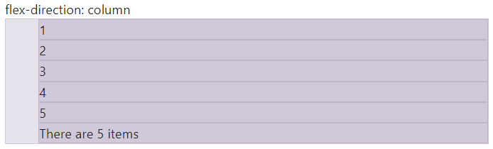
flex-direction: column
<ol class="flex-container flow-column bd-highlight">
<li>1</li>
<li>2</li>
<li>3</li>
<li>4</li>
<li>5</li>
<li>There are 5 items</li>
</ol>
4.決定 flex item 的大小

Figure Source: [1]
5.決定 flex item 的對齊方式

Figure Source: [1]
建立 flex-box 容器; 決定流動方向
display: flex: 建立 flex-box 容器. 底下的子元素成為 flex itemflex-direction: 決定 main axis 的方向, 可設定以下的值- row, row-reverse
- column, column-reverse
決定 flex item 的大小
flex container 中 flex item 的尺寸預設行為:
- 主軸方向可縮小, 但不延展:
- flex item 在主軸方向的尺寸會自動縮減, 當 flex container 的尺寸變小時。
- 但, flex container 尺寸變大時, 主軸方向的尺寸不變。
- 切軸方向延展填滿: flex item 將被延展(stretch)填滿切軸方向的空間(可讓元素高度自動對齊)。
- flex item 大小預設為 auto (
flex-basis:auto), 寛度為內容的大小。
設定 flex item 大小的 CSS 特性:
flex-basis: item 的主軸方向的基本尺寸- 可用尺寸單位或者比例指定尺寸
- 元素中的
width有較高優先, 若有的話.
flex-grow: 用來分配剩餘空間的放大權重因子flex-shrink: 當 flex container 的空間不足時, flex item 要被縮小的權重因子
flex-grow
最終主軸方向尺寸 = 基本尺寸 + 分配到的額外空間尺寸
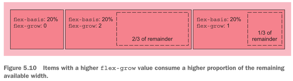 Figure source: [2]
flex-shrink
最終主軸方向尺寸 = 基本尺寸 - 分配到的不足空間尺寸
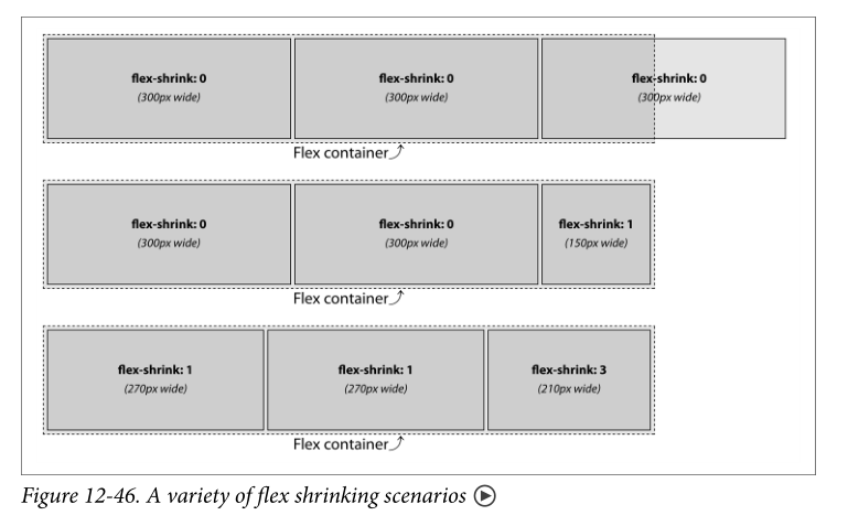 Figure source: [3]
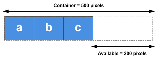
flex-shrink 的計算方式 container size: 750px 每個 item 的基本尺寸: 300px overflow 150px
3 個 flex-item 的 flex-shrink 的總合: 1 + 1 + 3 = 5. 每個單位因子權重的縮小尺寸: 150px/5 = 30px
item 1 及 2 最終尺寸: 300px - 1 * 30px = 270px item 3 最終尺寸: 300px - 3 * 30px = 210px
flex 簡寫特性
flex 簡寫特性可以一次依序表達 flex-grow, flex-shrink, flex-basis
item 的尺寸預設行為:
flex-basis:auto- 依內容決定大小flex-shrink: 1- 尺寸可縮小flex-grow: 0- 但不放大
1
2
3
.item {
  flex: 2 1 auto;
}
相當於
1
2
3
4
5
.item {
  flex-grow: 2;
  flex-shrink: 1;
  flex-basis: auto;
}
測試區
對齊 flex item
在容器內對齊 flex item
- 主軸方向的對齊:
justify-content - 切軸方向的對齊:
align-items - 允許自動換行時(wrap), 切軸方向的對齊方式:
align-content
justify-content
Q: 有多的 container 空間時, 如何擺放 flex-item, 沿著 main axis 的方向?
測試區
align-items
Q: cross axis 方向上, flex item 尺寸不一時, 如何對齊?
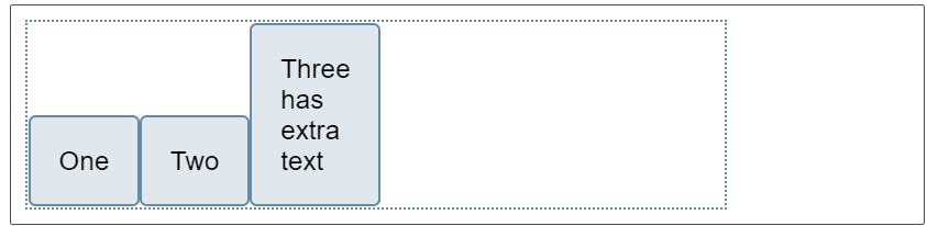
align-items 的預設值為 stretch.
align-items: flex-end:
測試區
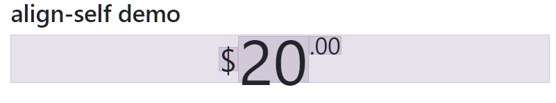
align-self 對特定的 flex-item 做調整
1
2
3
4
5
<div class="cost bd-highlight">
    <span class="cost-currency bd-highlight">$</span>
    <span class="cost-dollar bd-highlight">20</span>
    <span class="cost-cent bd-highlight">.00</span>
</div>
1
2
3
4
5
6
7
8
9
10
11
12
13
14
15
16
17
18
19
20
21
22
23
24
25
26
27
28
29


.cost {
    /* Unitless values: use this number multiplied
by the element's font size */
    line-height: .7;

    display: flex;
    justify-content: center;
    align-items: flex-start;
}

.cost-currency {
    font-size: 2rem;
    align-self: center;
}

.cost-dollar {
    font-size: 4rem;
}

.cost-cent {
    font-size: 1.5rem;
}

.bd-highlight {
    background-color: rgba(86,61,124,0.15);
    border: 1px solid rgba(86,61,124,0.15);
}
References
-
https://css-tricks.com/snippets/css/a-guide-to-flexbox/
-
Grant, K.J., 2019. CSS in Depth, Manning.
-
Eric A. Meyer & Estelle Weyl, 2018. CSS: The Definitive Guide - VISUAL PRESENTATION FOR THE WEB, O’Reilly, 4th Ed.